Black Friday Cyber Monday Live Globe

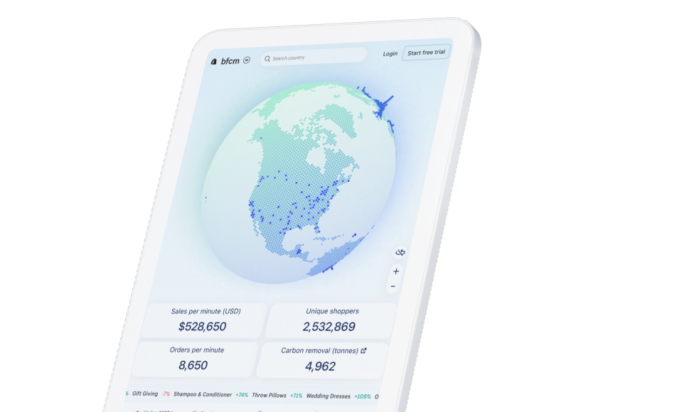
Demo / PrototypeRoleDurationTeammatesToolsArticle
- UI Design
- Prototyping
- Figma
- Codesandbox
- Spline
Context
Black Friday Cyber Monday is massive for e-commerce.Shopify's Merchants generate billions in sales during one of the biggest yearly commerce events.
0$
Billion01234567
.012345
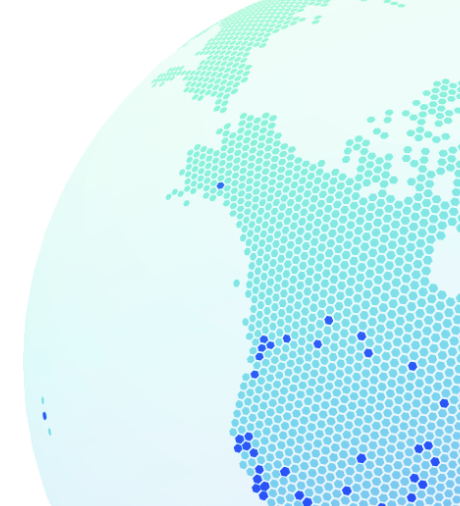
To celebrate entrepreneurship and showcase the impact Shopify-powered stores have worldwide, Shopify hosts its annual Black Friday Cyber Monday Live Globe.

Project timeline
Research
- Audit
- Project Intake and alignment
Design
- Explorations
- Design System
- Admin Integration
- Feedback
Launch
- Retrospective
- Recognition
Research and Scope
We started by examining previous globes projects and analyzed the features that we wanted to incorporate into the new experience. In addition, we had access to an internal tool that showed us feedback provided by users from the previous globe. This research allowed us to identify the necessary data reporting and data freshness requirements for the globe. Engineering worked alongside us to ensure the feasibility of these features.
Alignment
Aligning with senior leadership and marketing was crucial for the success of the project. We incorporated the marketing team early on into our design process to ensure that the globe was cohesive with Shopify's overall BFCM messaging. We placed a strong emphasis on hexagons in our design explorations, but we also explored other design options to ensure that we were considering all possibilities.Design Requirements
 Allow users to view live data and trends
 Interaction with the globe
 Variety of screen sizes and device types
 Impact within user's geographical region
 Admin integration
Design
We began exploring a wide range of treatments. As a team, we faced a challenge from both a developer and designer perspective: many of us had not previously worked with 3D.Initially, we attempted to explore ideas using 3D modeling tools such as Splines and various Figma plugins. Finally, we experimented with code sandboxes using Three.js. Thanks to our awesome developers, we were able to experiment and quickly iterate on stylizing the globe. At first, we were scrappily changing variables, but they set up a menu for us in no time. This made iterating with 3D a lot easier. I must admit, it was pretty enjoyable to mess around with code again.
Theming Decisions
During this phase of the project, we slightly deviated from the marketing brand kit vision. Senior leadership expressed a desire to incorporate more of the hexagon gradient treatment. Together, we decided that the two should complement each other, rather than dictate the appearance of the globe. Early Concept
Visualizing the Data
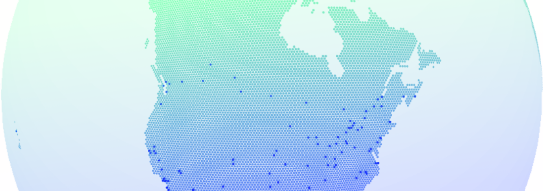
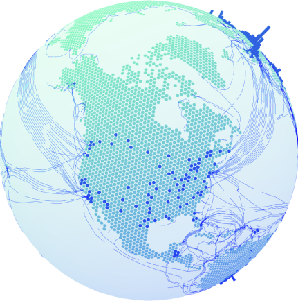
No optimize project is complete without a bit of data visualization. One thing that we noticed immediately was that we planned on having many different elements on the globe at once. We have individual particles, arches and hexagon all representing their own pieces of data. We went back and forth based on what was available with the 3D libraries we were using, and what made most sense to the data we had access to. Striking a balance between interactivity and readability was a challenge, but we ultimately decided on a few specific solutions. After agreeing on a general theme, we iterated on the density of the hexagons. Thanks to our awesome developers we had a “nerd” menu up to play around with the different parts of the globe later into our prototyping phase

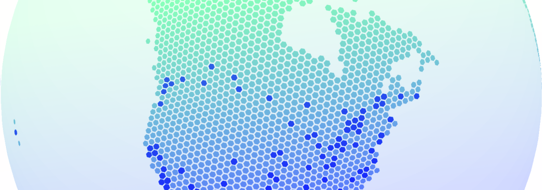
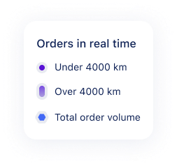 Legend for Orders in real time
Lives in the Admin
While exploring the globe, we also considered how we would be featured in the admin's real-time dashboard. I was part of the design team for the dashboard, which was receiving an overhaul at the same time. Juggling the two projects complimented each other well.Feedback and changes
We received feedback that the globe was not web accessible, so we toned down the colour treatment, which was challenging due to the tight timeline and 3D JavaScript library testing abilities. Scope creep occurred due to the tight timeline, and we had to audit the user experience to update the global site with more features. During testing, visualizing the freight caused a performance dip, so we allowed users to toggle on and off the freight route lines. We also updated the typography used for the numbers to feature monospace for better readability. Monospace typography introduced for better readability

Addressing accessibility concerns
 Adjusting colours based on contrast and different types of color blindness: Protanopia, Deuteranopia, Tritanopia
Breakpoints
One of the challenges we faced was supporting multiple device types. As with web development, an application has to run on screens of all sizes and orientations. With so much information on screen we had to make sure the experience was usable for these edge cases.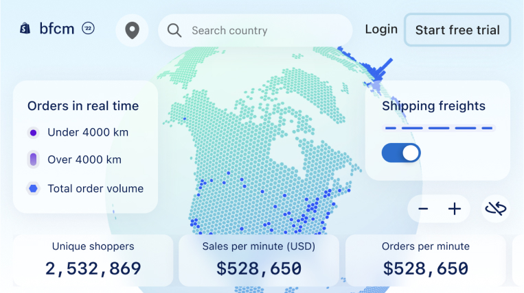 Making sure the globe was accessible across niche breakpoints such as mobile-small-landscape
Solution
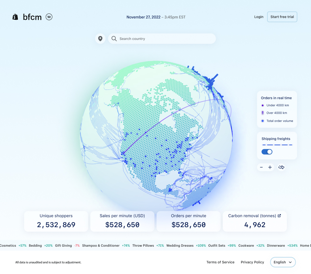
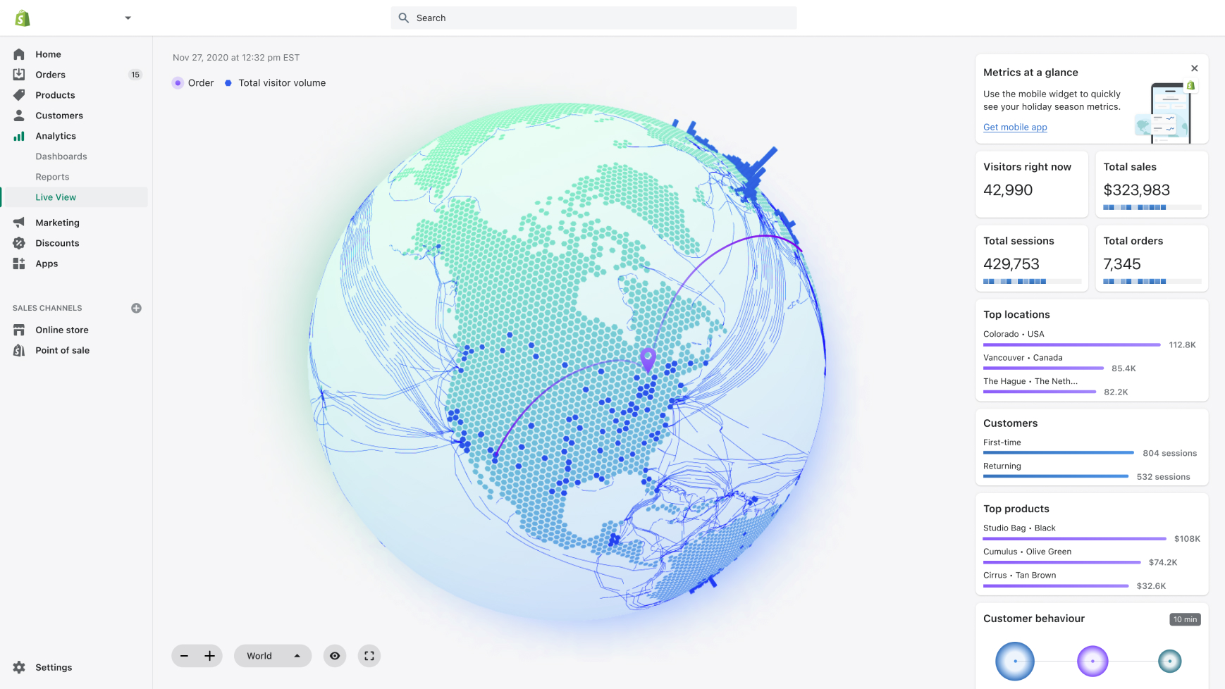
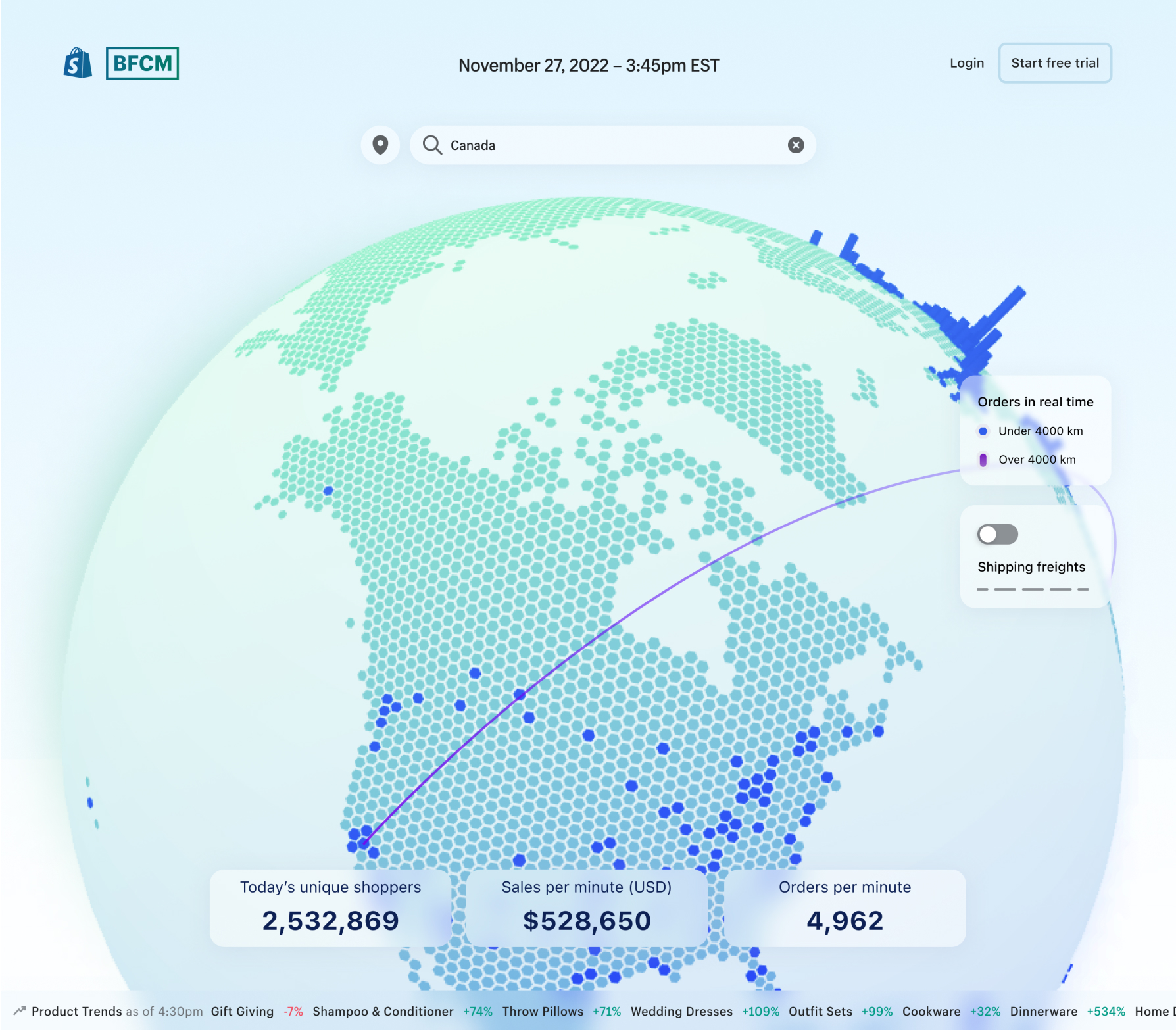
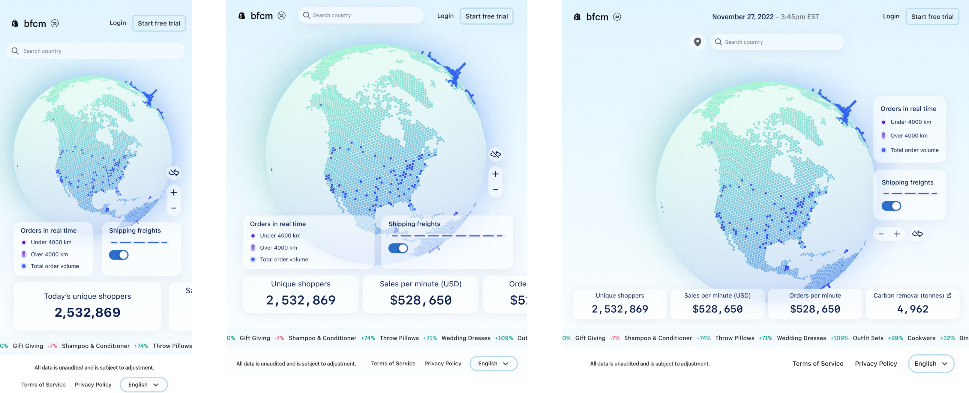
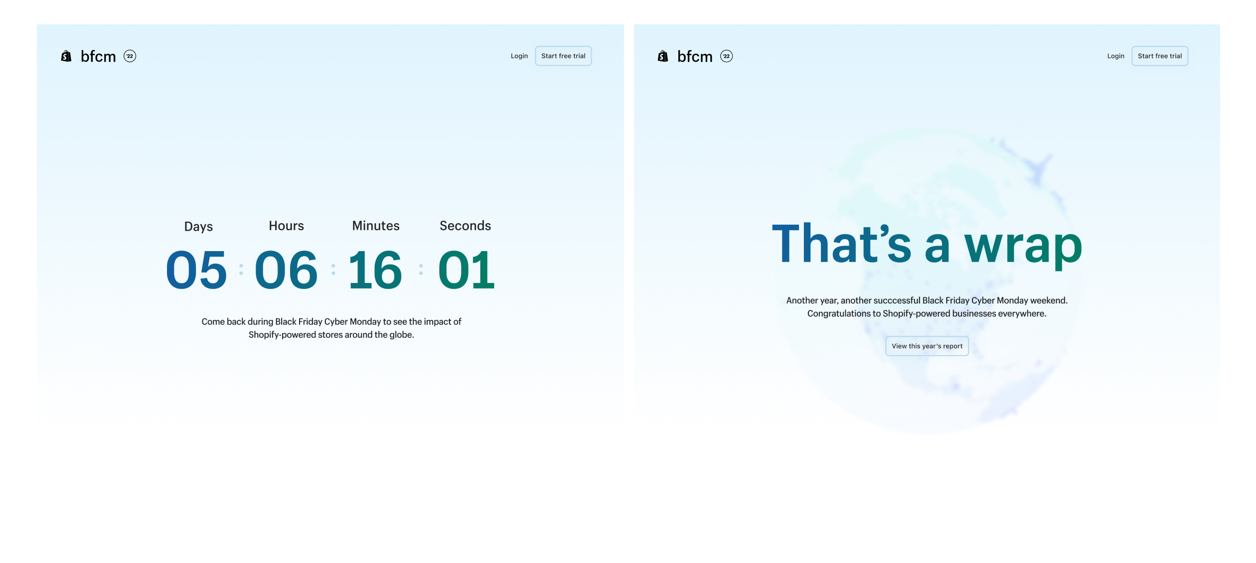
Press Attention
Launch was extremely exciting with this project as it was high visibility. Alongside the marketing effort the globe was featured on many billboards across major cities around the world. It was very satisfying seeing something I worked on locally here in Toronto. The globe designs were also featured on many news outlets including CNN!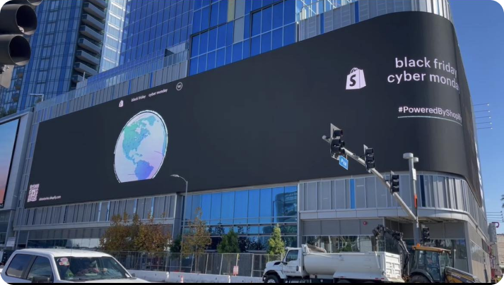 The globe on a billboard!
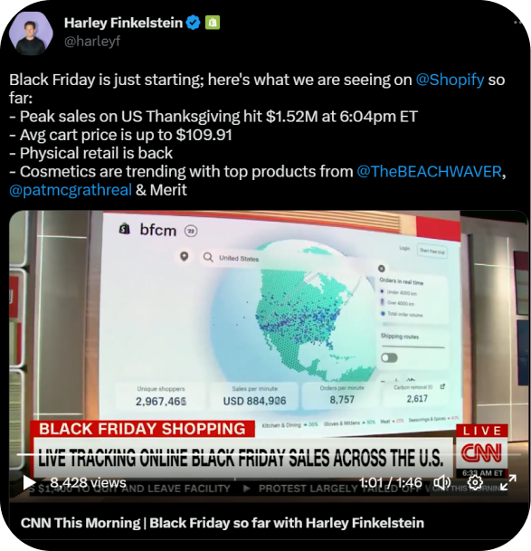 On TV!
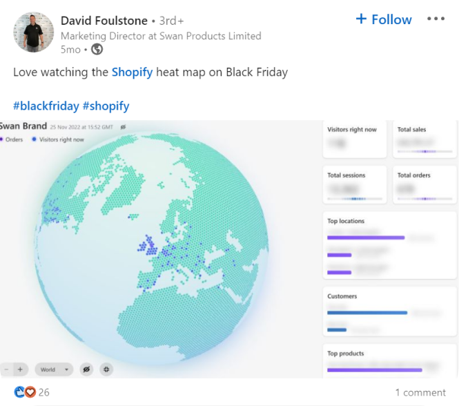 In merchant hands
🎉 Shoutout to the team!
Overall, working on this project was extremely satisfying, and I couldn't have asked for a better group of individuals to work with. The project pushed me outside of my comfort zone by attempting 3D, playing around with code, and trying my hand at marketing UX.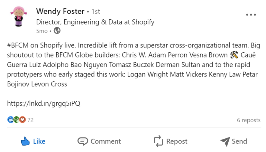
derman sultan • 2026I'm always up for a chat ☕Get in touch below or directly at abdurrehmansultan4@gmail.com